The Marks
The jQuery logo is used for illustration but these guidelines apply to all jQuery Foundation project logos.


Spacing Guidelines

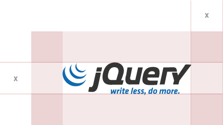
To ensure the logo isn't cropped or cut off, you'll need to create a minimum amount of "safe space." A proportional measuring system creates a consistent layout for use across all applications. The system is based on "X", as determined by the space between the top and bottom of the brand mark, tagline and the horizontal bars both above and below it. The minimum safe space should never be less than X.
Incorrect Logo Usage
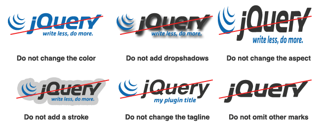
If you're following the guidelines correctly, your logo should never look like any of the examples below. To be absolutely clear, please do not attempt any of the following, no matter the situation.

Proper Usage
The jQuery Foundation project logos can be used in a number of ways, both commercially and by the open-source community surrounding that project brand. Please use the logos (following the proper brand guidelines we just addressed) to promote your own jQuery product on the web and in print, and even self-promoted jQuery meetups. Following these guidelines will ensure your product is representing the jQuery brand to the best of its ability and adding seamless interaction for your audience.
To use any jQuery Foundation project logo commercially, please contact us with specifics.
Download jQuery Foundation Logo Suite